Accessibility
Web accessibility is gaining more and more space in the context of software development. Given the collaborative nature of the web and its importance in the process of facilitating communication, we must ensure access to information and provide the same experience to all users, regardless of their physical and cognitive abilities or the platform and technologies used.
Disability is not just a health problem. It is a complex phenomenon, reflecting the interaction between the characteristics of a person's body and the characteristics of the society in which they live.
Not convinced yet?
According to data from the World Disability Report 2011 one billion people worldwide live with some form of disability (representing 10% of the world population). In the Brazilian scenario, access to information is a right of every citizen guaranteed by the Federal Constitution. Besides that, the last Census presents data indicating that 45.6 million people (23.9% of the total population) have some kind of disability.
Our goal is to build inclusive digital products to enhance the experience of all users. Accessibility means making people independent and ensuring they can complete their tasks in a similar effort and time as someone that does not have a disability.
Accessible components
Bold components were built following the specifications of WCAG, conforming to AA level. Bold design system enables accessible development by providing semantically correct components, each with an appropriate ARIA markup so that they can be correctly identified by assistive technologies. However, it is important to keep in mind that the design system is only the foundation for the development of affordable applications. We recommend that you review and test your applications to ensure they conform to WCAG standards at the AA level..
How were the accessibility tests carried out?
The components and principles that make up Bold design were tested to ensure that they were suitable for accessibility. The process involved two stages of testing, the first with automated tools and the second with users.
Testing with automated tools: we verified the contrasts and suitability for version 2.1 of the WCAG, suitability for e-mag, and automated testing tools (post-development): Google's Lighthouse and Deque's Axe.
User testing: the efficiency, effectiveness, and satisfaction of bold users were tested through a usability test with a specific audience:
- 1 user with visual impairment (blind);
- 4 users with visual limitations (low vision, color blindness);
- 2 users with temporary motor limitations (keyboard use only).
Both the testing with tools and with users provided data used to improve the components and solutions implemented in BOLD. To see the complete study, go to: https://repositorio.ufsc.br/handle/123456789/197794
Best practices
Color
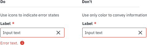
- Color should not be used as the only visual means of conveying information, indicating an action, prompting a response, or distinguishing a visual element.
- Limit the use of reds and greens, because it is easily confused with the more common type of color blindness.
- Plugin Stark for Sketch, make possible to see how the mock-ups are seen by different types of color blindness.
Contrast
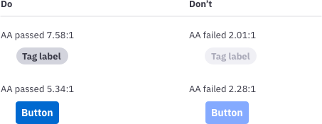
In general, text and images must meet an optimal 4.5: 1 minimum contrast (for fonts equal to or less than 14pt), except for:
- Large texts (18.6px or 14pt) should maintain the contrast of at least 3: 1.
- Decorative text /image and disabled states don’t have contrast requirements.
- Logo or text that makes up a mark need not be within the ratio of contrast.
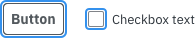
Focus
The component focused by the keyboard must be clearly marked, and the selection area must be clickable. By default, links and form elements already display the highlighted border when they receive focus from the keyboard. This border can be modified via CSS to enhance highlighting, but should not be removed.
We use and recommend that the minimum edge thickness should be 2 px.
Assistive technologies
When people start to develop with accessibility in mind, it’s a common error add focus to every element on the page, including text and titles. This difficult the navigation of users who can see and can hinder who depends on a screen reader, because these technologies already provide focus to these elements.
Titles, text blocks, and disabled fields should not receive focus.