Iconography
Icons represent objects, actions, and states, and are used to communicate a message. Each icon is designed to be simple, friendly and reduced to its minimal form, expressing essential characteristics.
Icon Grid
The icon grid establishes clear rules for the consistent, but flexible, positioning of the graphic elements.
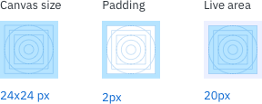
Size and weight
All icons are built on a 24px square with 2px of padding. System icons use a consistent stroke width of 2px, including curves and angles. When using icons, all touch target need to be 40px or higher. Icons of the same size should have the same visual weight. One icon should not look heavier or lighter than another icon of the same size. Glyphs or 16px icons should always be a filled icon, this assures that the icon stays legible.

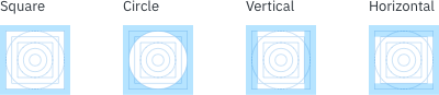
Keyline shapes
By using the core shapes based on the grid, you can maintain consistent visual proportions throughout your icons.
Pixel perfection
To avoid distorting an icon, position icons “on pixel” by making the X and Y coordinates into integers, without decimals.
Examples